You need landing pages - great, high-performing landing pages that convert a high percentage of visitors.
You need to capture leads. You need customers.
In other words: you need landing pages. Great, high-performing landing pages that convert a high percentage of visitors.
But consider this:
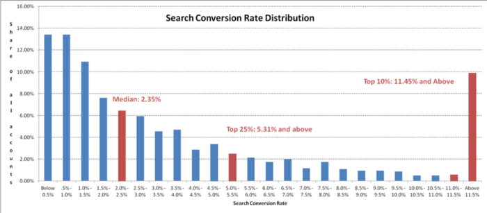
The average conversion rate of landing pages is 2.35%.

How can you create your landing page to exceed this average and convert at a far higher conversion rate?
For instance, how can you be in the top 10 achieving 11.45% and above?
To start with, you need to follow landing page best practices to make sure you’re starting with great a design – that’s one of the most important steps in developing a high-converting page.
Download our Individual Member Resource – 7 steps to creating high-converting landing pages
The guide has over 50 examples of best practice to inspire improvements to your landing pages covering a range of sectors from retail, financial services, travel, business-to-business and not-for-profit.
Access the
In this blog post, discover 12 best practices for creating high-converting landing pages.
1. Use the right landing page builder
The first step in creating a landing page that turns visitors into leads is to use the right tools. This way, you can express your ideas effectively on your landing page.
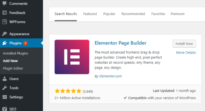
Of course, the landing page builder you choose will depend on your needs. For instance, if you use WordPress and you’d like to build a landing page without leaving your dashboard, Elementor is a great option for this.
If you work as a one-man team, you can easily download the WordPress plugin and design an effective landing page free of charge, directly in your WordPress. There are over 300 templates to choose from and customize, and plus, you can also edit and customize the mobile version of your landing page – all with an easy-to-use drag-and-drop editor.

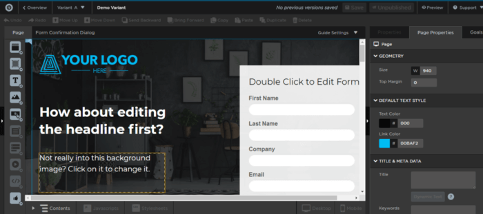
However, if you run an agency, a landing page like Unbounce would be more suitable as it caters for this type of businesses. Unbounce provides tools like A/B testing, page duplication across different campaigns, and dynamic text replacement for your paid ads campaigns.

2. Make your landing page simple
When it comes to creating a landing page, this best practice will never go out of fashion. That’s because a simple, uncluttered page makes it easy for visitors to understand your page offer and find your CTA button.
If you make your page too complicated and busy, there’s a high chance you’ll confuse your visitors rather than convince them to convert. This is the most important question to ask while creating your page:
What are the vital elements that move visitors towards conversion?
Only have these elements on your page.
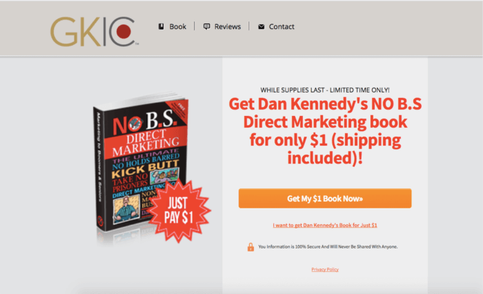
Look at this landing page by GKIC:

This page is very simple and clearly explains its offer in a single sentence. It’s easy for a visitor to understand the page offer and even easier to take action.
3. Have effective copy on your landing page
Even though there are usually only a few words on landing pages, these could make all the difference when it comes to conversions. Is your landing page copy clear enough about your offer? Is it compelling enough to convince people to take action?
The last thing you need here is to be ambiguous. Likewise, if you have a benefit that sets your product apart, this is where to tell your viewers about it.
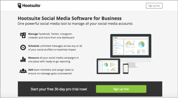
Take a look at this landing page by Hootsuite:

The copy explains the basic functions of the software. The bolded texts and icons make it easy for a visitor to skim through the page and still get the message – in seconds, they can decide whether they should start the trial or try something else.
4. Understand your visitors’ needs
No single page design can work for all businesses. That’s because needs vary across different industries and types of businesses. While creating a landing page, you have to understand what potential leads need to see on this landing page to convert.
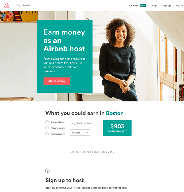
For example, look at this Airbnb landing page:

This is a page for people who are looking to host visitors at their homes. As you already know, most people involved in home-sharing do so because of the financial compensation. Therefore, it makes sense that Airbnb provides a calculator to help prospective hosts see potential earnings – and a great idea to engage their visitors and get them to convert.
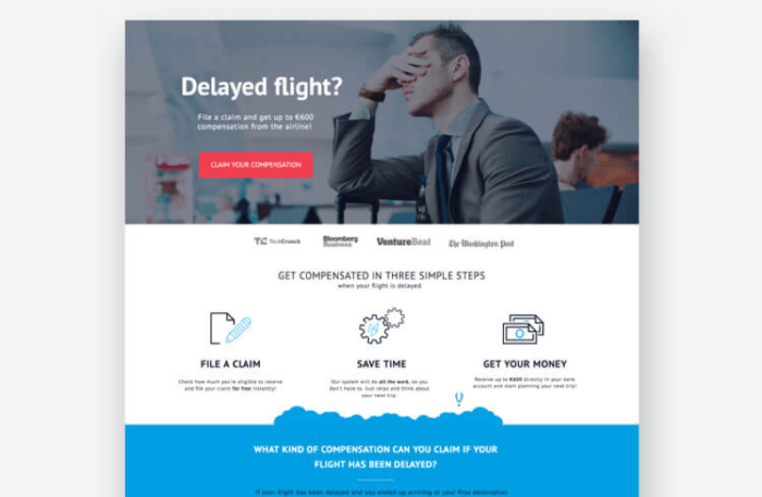
See another useful example from Claim compass:

Most people who need this service have no knowledge of the process. So Claim Compass explains the process to convince potential users with clear and to-the-point copy.
5. Remove navigation bars
A landing page should be focused on converting your visitor; you need to keep people on your landing page until they take action and not, like with your blog or other pages on your website, get them to visit multiple pages. With this in mind, your navigation bar is a distraction that could bring your conversion rates down.
Think about it this way: every outbound link on your landing page is an opportunity for visitors to leave without converting. Now, the surprising statistic is that only 16% of landing pages are without navigation bars.
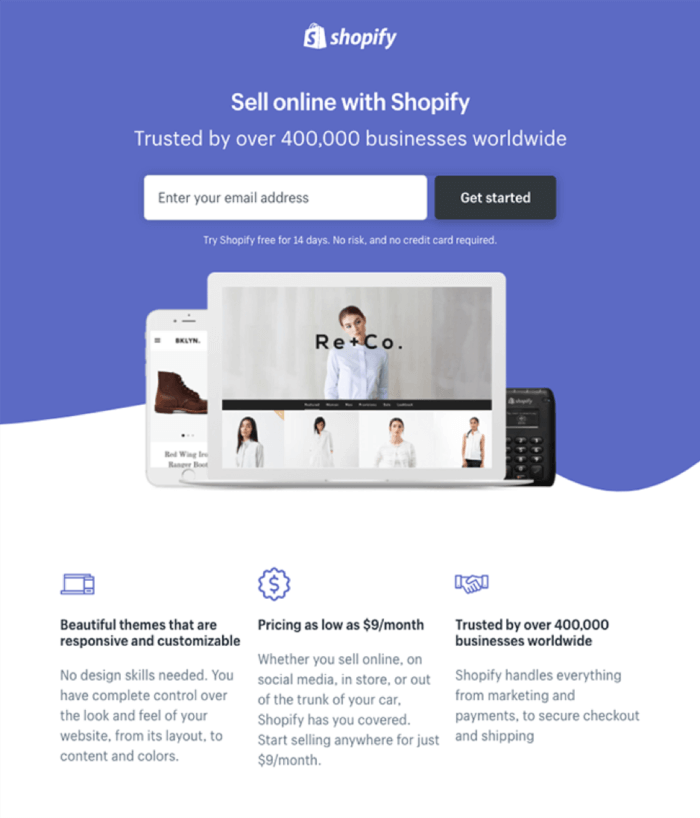
Look at this landing page by Shopify:

There’s no navigation bar and it leaves a visitor focused on the offer; whether they decide to get it or not is up to them (and the landing page copy and design, of course!) but without the navigation bar, they’re not distracted about other information and instead, they’re staying on your page.
6. Have a lot of white space
To make your landing page copy easy to read and follow, you need space between all the different elements on your page. A visitor should be able to go through your offer and decide if it’s right for them in just a few seconds – not more.
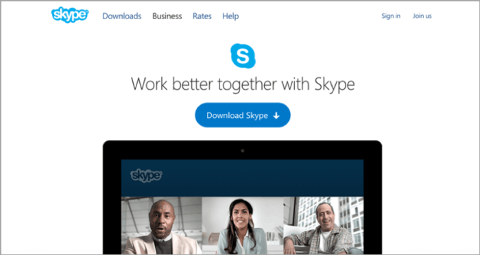
And Skype has done this excellently on its landing page.

There are a few words on the page and a visitor can get to the call to action button easily. The white space used focuses the visitors’ attention exactly where they want it. Use the same strategy and employ lots of white space to make sure visitors notice your offer from the first glance.
7. Use an obvious CTA button
Your CTA button is the path to conversions. Therefore, it should be impossible for visitors to miss when they visit your page.
Likewise, your call to action should be related to your landing page offer rather than a generic word like “submit” – that makes it even clearer to the visitor what they have to do.
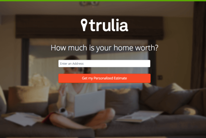
If you visit this landing page from Trulia, you’ll notice it’s impossible to miss the CTA button:

Not only is it visible from the second you visit the page, but it also stands out because of the contrasting red on the faded background and, plus, it even shows the value of clicking on that button (i.e. getting a personalized estimate).
8. Use visuals
As they say, a picture is worth a thousand words. This can be the case on your landing page. Images and videos call people’s attention and they can help push them towards taking action.
You can use visuals to deliver your landing page message, or, at the very least, as a support to your page copy.
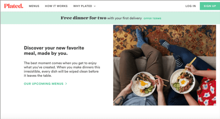
This is what Plated has done with its landing page:

The page talks about a meal and a free dinner for 2 on the first delivery. The image supports this copy with 2 people holding plates containing meals, a great idea as it puts an image into visitors’ heads of what their future meals could look like – if only they click to get the offer.
9. Use social proof to boost trust
How do you convince people to believe in your business and submit their information? Show them how other people have benefited from your business. This way, a potential lead sees the benefit they too can get from your business.
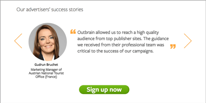
See this testimonial on one of Outbrain’s landing pages:

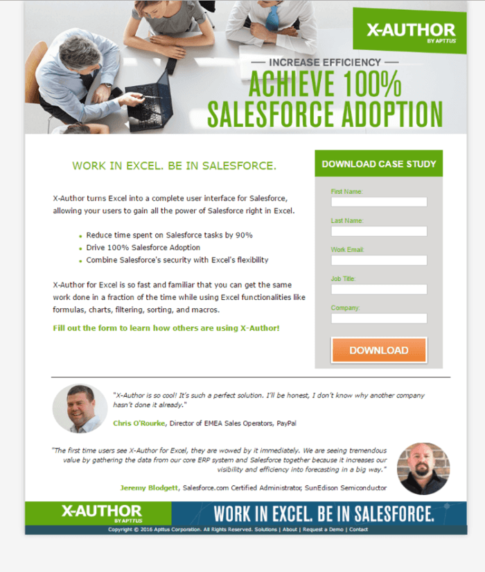
Check out this one too from X-Author:

These pages show professionals who have gotten results from using those services. That’s more effective than any copy you would write yourself because testimonials from genuine customers always hold more weight – and help boost trust.
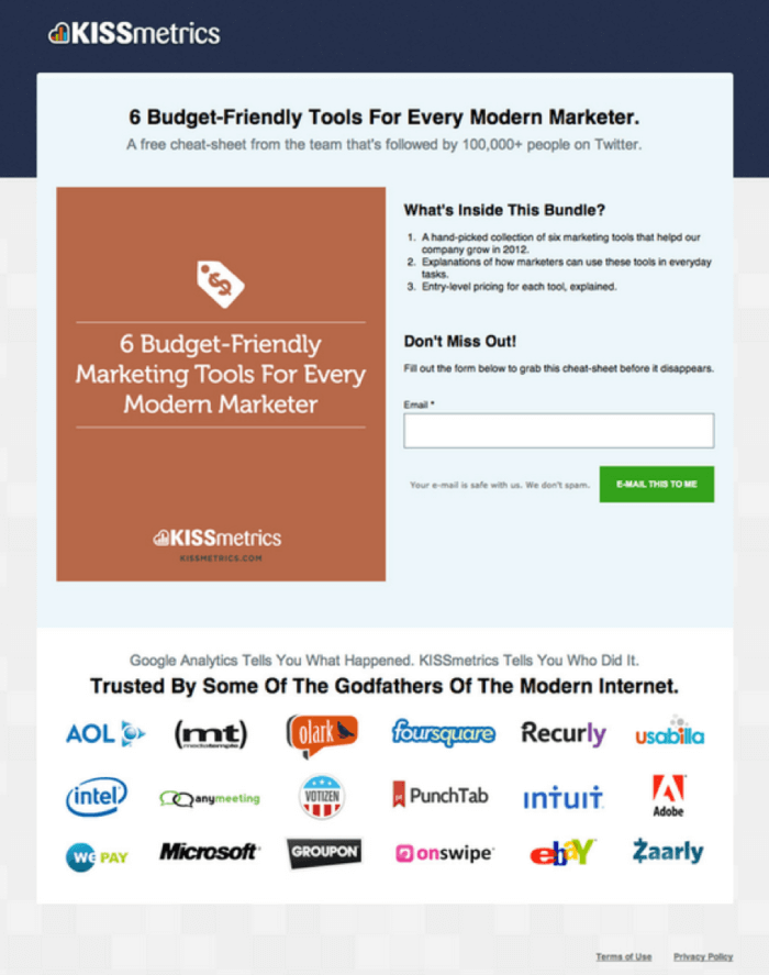
In another sense, Kissmetrics has shown social proof by displaying big brands that depend on its service:

Seeing some of those recognizable logos and brand names will show visitors that they can trust this service and it might even make them think – if it’s good enough for them, is it good enough for me?
10. Use a lead magnet
If you want to get genuine leads, you need to provide value first. And that’s where lead magnets come into the conversation.
What are some problems your potential leads have that you can solve within a short period of time? Create a piece of content or make an offer to solve this problem and use it as a lead magnet.
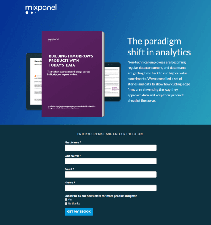
This is what Mixpanel has done with this landing page by offering an ebook in exchange for people’s contact information:

If you don’t give your visitors a good enough reason to convert, then they simply won’t take action. Offer them some sort of value and you’re increasing the chances of your visitors actually converting.
11. Optimize your page for search engines
If you want to get free and targeted and traffic to your landing page, then you absolutely need to optimize for search engines. All you have to do is carry out keyword research to find a valuable target keyword.
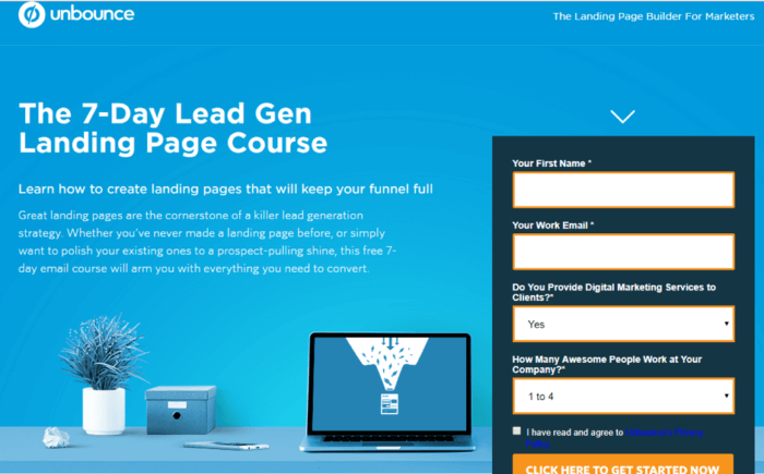
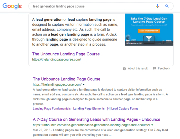
Then you can optimize your page copy for this keyword. Unbounce did this with their lead generation landing page course:

This page has been able to rank first for “lead generation landing page course.”

And what that means for them is that they can get leads on autopilot, with little effort on their part. Whenever someone searches for those keywords, they’ll find that course first in search results – which can mean a substantial amount of traffic from search engines. Not to mention, being amongst the first in search results can also boost people’s trust. After all, Google clearly trusts you – and your content.
12. A/B test your landing pages
A constant activity you need to do in order to improve conversions, is, quite simply, testing. Lots and lots of testing. To find the best performance for your landing page, you need to test various elements at a time (i.e. A/B testing), track conversions for each change and then implement relevant changes as you go along.
To do this effectively, you can use a tool like Crazy Egg. This will provide all the necessary metrics to help you track your page performance during the test. You can also use your landing page builder if this feature is supported.

When Truckers Report tested the number of form fields on its landing page, this led to 13.56% increase in page conversions.

A/B testing is very much a continuous process, something that you need to do constantly if you want to keep improving your conversion rate. Unless most of your visitors are converting (and that very rarely, if ever happens) then there’s always room for improving your conversion rate.
Conclusion
Creating high-converting landing pages takes a lot of thought and practice. But, by following the landing page best practices listed in this article, you’ll know exactly what elements you’ll need to include in order to build high-converting landing pages for your own business.


