A recommended wireframe and best practice examples for retail Product Details Pages
In part four of our review of best practices for different types of retail site pages we will cover the Product Details Page (PDP). Of course, the product page template is an essential page in the conversion path and when visits are aggregated across all product pages, this often represents the largest chunk of total views or 'footfall' when viewed in analytics.
Product details pages are accessed both as part of a wider online purchasing journey, for example browsing a category page and then navigating through to specific product, such as campaign or landing pages.
It’s therefore important to understand the different user needs as not everyone who visits a Product page will be ready to buy, so the page also needs to provide as much relevant and useful information as possible.
Sometimes large catalogue retailers use more than one template design because optimisation teams test page layout variations for different product categories to determine which format works best.
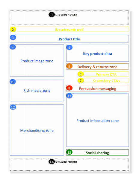
Key ecommerce Product Details Page wireframe requirements
This template outlines the core elements for your PDP and again UX/UI design patterns can vary across sites, so it's designed as a good practice framework, to adapt to your business and audience's needs.

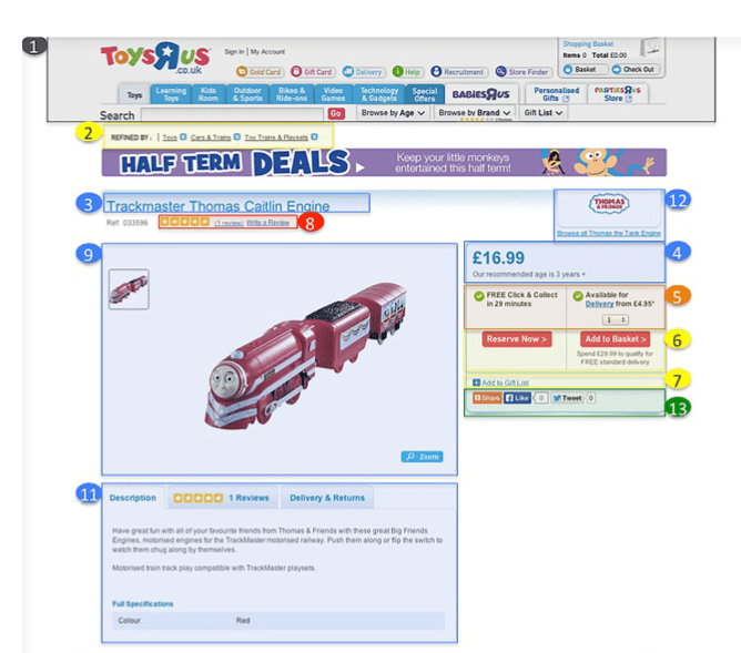
Product Page example for Toys' R' Us
In our guide to Ecommerce design patterns we look at more examples, but here we just look at Toys' R' Us who have refined their pages over many years, both in the UK and US.
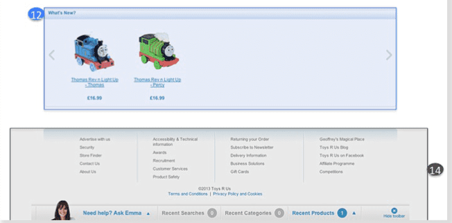
The example shows that they have a streamlined, content-light design. However, it’s surprising to see such limited content for the product. There is only 1 image, which makes the thumbnail irrelevant, and the product description fails to excite. We also think the placement of the 'Browse all Thomas the Tank Engine' merchandising link at the top of the page isn’t ideal as the focus here is on the current product and key details. It would be interesting to see if the web team has done placement testing and validated that this location drives the best click-through rate.


Key requirements for a Product Details Page (PDP)
Some key questions to review covered in more detail in the guide.
Q1. How we defined and understood the goals for PDP?
Q2. Do we know who are core visitor groups and personas are?
Q3. Do we know what information each persona will need?
Q4. Have we got the required content to to answer key user questions?
Q5. Do we make it easy to access product information?
Q6. Have we made ' add to basket' easy to find and use?
Q7. Have we defined web analytics requirements?
Q8. Have we identified on page SEO content requirements?
Q9. Have we defined content personalisation requirements?
Q10. Have we defined a clear structure for the navigation elements?
Q11. Do we use personalisation techniques such as customer ratings to influence visitors?
Q12. Are we linking to relevant cross and up-sell product associations?
Q13. Can users add these products to the basket from the same page to avoid additional clicks?
Q14. Are we promoting our current product-level discount/promotion?
Q15. (Multi-channel only) Is it easy to to find our local stores and stock availabilty for the product being viewed?
Q16. (International only) Is it easy for users to select the store/currency for their local country?
Additional requirements to consider in your homepage
In the full guide for Smart Insights Expert members I go into much more detail on individual page elements and look at more examples of how these apply in practice from UK and US-based ecommerce sites.

Recommended Guide: Ecommerce Design Patterns
Use our wireframes and examples to test and create more persuasive Ecommerce designs to boost retail sales.
Download our Ecommerce Design Bible.


