Recommended best practices for Product Listing Pages
This is the third in my series of posts to share best practices on design and user experience for retail sites. My post aims to give you some tips to consider for testing improvements and designing your Product Listing Page (PLP). For each site page template type I have created a wireframe summary of a typical responsive site layout for desktop or tablet rendering showing key design elements, to give you a toolkit to review and optimize your pages.
If you work in design or merchandising for a retailer, or are involved in design at an agency for retail client’s accounts, then I hope these templates and tips will help you along the design/re-evaluation process to maximise results from your pages.
For retail sites, PLP pages sit within the category hierarchy and provide a list of all products available within a chosen category. For large catalogue retailers, these are usually found at a secondary or tertiary level e.g.Home & Garden > Garden > Garden Furniture.
In terms of the whole customer journey they are important mid-tail conversion pages, to showcase specific product sets and use navigation tools to help the visitor quickly find the most relevant product.
Key elements of a retail Product Listing Design Page
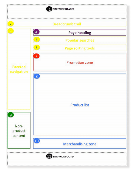
The key design elements of a Product Listing Page are summarised in this wireframe

You can use this template as a good practice framework to understand the key elements for an effective Product Listing Page. UX/UI design patterns can vary according to your site and depend on the extent each component is used (ie. by content, location on the page, scrolling done and across the page)
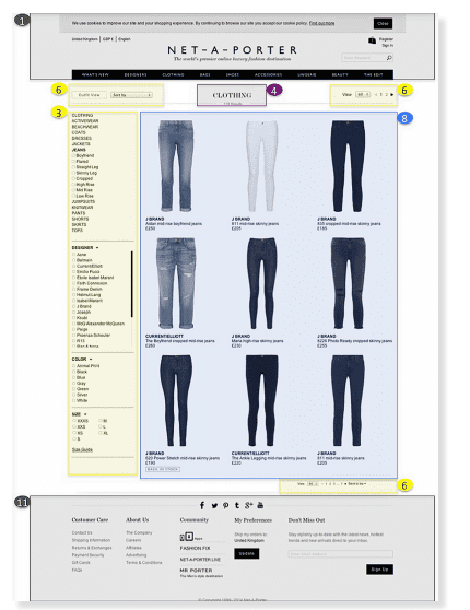
For example, some retailers actually use the PLP template for their main category page (ie Net a Porter) instead of using hub pages with PLPs for each sub-category.
Please note that site-wide components such as the mega menu are covered in my first post in this series on Retail site Home Pages.
A Case Study - Net a Porter
The site adopts a very simple page template, with a long list of products with basic navigation tools like faceted navigation and sorting tools. For a high-end brand, it’s really surprising not to see promotional content such as featured brands and newest additions. It’s not sensible to judge the page design qualities without having an understanding of the data behind it. Perhaps the ecommerce team has tested different version and found that its customers like a simple PLP format to browse all products.

Key requirements checklist for your Product listing Page
Here's a checklist of the details that I've found are involved in the discussion of improving this type of page:
- 1. Have we defined and understood the goals of our PL Page?
- 2. Which of our core visitor types/personas will visit this page?
- 3. Do we know why they visit?
- 4. What is the primary CTA for our page?
- 5. Have we defined the core content components to enable our goals/satisfy key persona needs?
- 6. Have we defined our web analytics requirement?
- 7. Have we defined on-page SEO requirements?
- 8. Have we defined personalisation requirements?
- 9. Have we defined the navigational requirements?
- 10.'Do we make it easy to refine the product view and drill down into specific product types?
- 11. Do we use persuasion techniques to influence visitors?
- 12. Are we showcasing our key brand ranges?
- 13. Is the site search bar clear and easy to use to help users who want to find something specific?
- 14. Are we promoting our current marketing campaigns and current offers?
- 15. Do we provide relevant content to help visitors?
- 16. (multi-channel only) Is it easy to find our local stores?
- 17. (international only) Is it easy for users to select the store/currency for their local country?
- 18. Are we using site-wide links to help people find key information like delivery and returns?
Additional requirements to consider in your Product Listing Page
In the full guide for Smart Insights members I go into much more detail on individual page elements on desktop and smartphone and look at more examples of how these apply in practice from UK and US-based ecommerce sites.

Recommended Guide: Ecommerce Design Patterns
Use our wireframes and examples to test and create more persuasive Ecommerce designs to boost retail sales. Covers Desktop and Mobile page templates.
Download our Retail Ecommerce site design 'Bible''


