Using eyetracking to assess the 3Ws of your landing pages
Imagine that you are at a reception in a massive hotel ballroom, and Barack Obama is the guest of honor. You desperately want to speak with him about a brilliant idea, but know that you will only have a few seconds to catch his attention before he is whisked away by his security detail. So, what do you do? Flash your accreditations and references? Dress up in a clown costume and perform your rendition of the robot? Launch into a slam-poetry version of your master’s thesis?
These tactics to get attention may seem improbable, but they are precisely the kinds of mistakes in building a landing page that we see at Eyequant all the time.
Landing pages are designed to give the user a branded and actionable gateway into an online offer. Without stretching our poetic muscles too far, a good landing page should feel as crisp and as fresh as a sunny morning walk in newly fallen snow (something we know a lot about here in Berlin).
3 Ws Framework:
Essentially, three key elements should be visible within the first few seconds of arriving at a landing page:
- 1. What your offer is about: This is your handshake, succinctly describing who you are and how you help people.
- 2. Why your offer is important: This is your value proposition, highlighting why you are great and why you differ from your competition.
- 3. Where a user should go next: This is your Call-to-Action, and it is the key to a high-conversion rate.
EyeQuant likes to call these elements the 3W’s; they create a basic framework needed to effectively communicate your most important content. The problem is, it can be difficult to predict where and how these elements should be placed without analytical tools to track the way in which users interact with them.
Understanding the science of attention is complex, and goes way beyond simple rules-of-thumb, but the following hints will help you to effectively optimize your landing page in collaboration with EyeQuant’s software, allowing you to accurately predict user attention even before your changes go live:
3 Hints to optimise your landing page:
- Hint 1: Shine a spotlight - Luminance Contrast
Luminance Contrast refers to the brightness of an object in relation to its surroundings. We often think of the color red, for example, as attention-grabbing due to its emotional connotation of urgency and importance; however, red will only stand out if it has a high luminance contrast in relation to its surroundings.
A recent study conducted by EyeQuant’s scientific advisors at Caltech found that adjusting the luminance contrast of a product dramatically affects consumer decision-making, especially when they are in a rush, swamped by similar products, or multitasking.
- Hint 2: Room to breath - size and space
The larger an object is, the more noticeable it typically becomes. A truck driving down a country road is far more visible than the woman riding her bicycle in front of it.
All the same, making one element on a landing page too big will actually counteract the attention it might otherwise receive.
It may seem like a good idea to put your company’s description in 300 point font, but the result will be akin to a background image - users will simply ignore it as decorative.
Why? An augmentation in the size of an object, whether it be text or image-based, means a decrease in the space around it, and space is a valuable commodity in landing page design. This is especially important to remember when placing a Call to Action button: This is your grand finale, and it needs some room to shine.
Success of Groupon
De-cluttering the area around your CTA button will draw user attention to it immediately, because it will become the only visually “busy” area in what could otherwise be thought of as no-man’s land. A great example of this is a case-study conducted by EyeQuant customer Groupon, who were able to achieve a staggering 52% conversion uplift by properly spacing and sizing their landing page.

- Hint 3: Location, location, location
Just like in real-estate, a landing page contains high and low-value locations.
On English-language web pages, for example, the upper left corner of the page is coveted because this is where most users are trained to start reading. The same is the case for the mid-right of the page, which is a location our eyes tend to pause at, and a natural place for a Call-to-Action to appear.
At the same time, areas such as the top right corner or bottom left corner of a page tend to be reserved for less important information, because they draw far less immediate attention.
Absolutely anything below the fold, meanwhile, should be thought of as all the way out of town - this is the last area of a landing page a user will explore in the first 3 seconds.
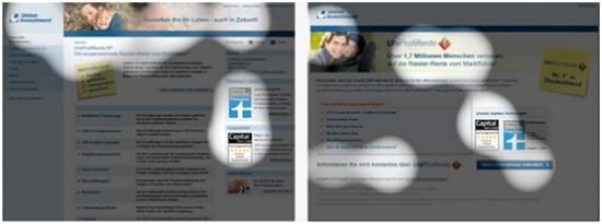
After using EyeQuant to test their landing page, Union Investment were able to achieve a 170% improvement in their conversion rate , simply by moving their CTA above the fold and into a higher-value position.

In 2003, a user spent about 10 seconds exploring a web page before deciding how to proceed. In 2013, that attention span has dropped to between 3 and 5 seconds, meaning that Marketers must ensure that their landing pages are laser-focussed, and most importantly, based on attention-driven design.
Eye-tracking studies measure the distribution of user attention with excellent accuracy, but they require a large budget and a generous time-frame, which can be a deterrent for most companies. Over five years ago, EyeQuant recognized the need to bridge the gap between affordable data-driven web analytics and the high level of accuracy achieved by eye-tracking studies researching online user attention.
You can test your own websites with EyeQuant simply by signing up here, the first test is always free, and will provide you with new optimization insights.

Thanks to
BitsyKnox for sharing their advice and opinions in this post. Bitsy Knox is the Communications Director at
EyeQuant You can follow EyeQuant on
Twitter or connect on
LinkedIn.


 Thanks to


