Great examples of websites with effective online value propositions (OVPs)
 "Why should I do business with you online?" is the question on the subconscious minds of all site visitors and especially first time visitors.
I believe the design has to emphasise your key offers and why we should do business with you online rather than via another channel or a competitor. I call this an Online Value Proposition.
I'm always on the lookout for sites that do this well, so thought it would be handy to present some examples here from different sectors.
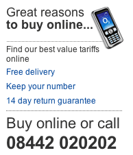
I like the example on the left from O2 which they use in the area of the site where visitors are viewing phones. It has links to the main parts of the proposition to help support the decision and highlight it with a good hook, image and large font. It's often best to use a hybrid container with text and imagery to capture the visitors attention and avoid "banner blindness".
Retail OVPs
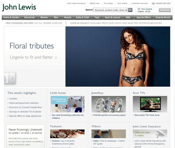
Let's start with a classic example - using the area above or below the nav to show delivery or returns policy. This has the advantage of making the OVP clear site-wide. Many make the mistake of only including it on the home page.
I like the way John Lewis also show their multichannel 'click and collect' offer. They also have a panel on the lower left of the home page which summarises their offer.

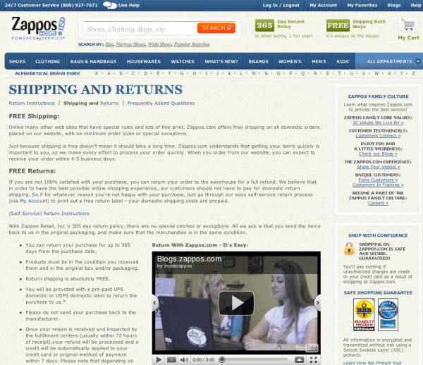
Of course the OVP starts with the search results page. Zappos reminds us - they make their OVP clearer than most in their home page title and description:

Once you're on the site they have clear OVP within their masthead which links to the detail to support their claim. This is another trick with the OVP - you should link to supporting detail:

Financial service OVPs
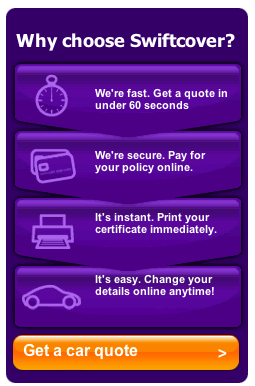
Traditionally insurers have offered an online quote discount as part of their OVP, but since most now take a quote online it's becoming more about the service. I like this Swiftcover container from their homepage which groups their OVP together.

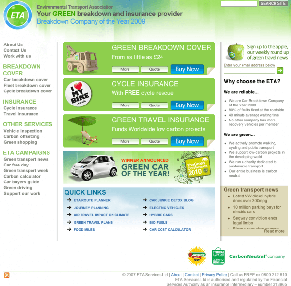
And another example - from the service I use but many won't have heard on, so it's important for the ETA to have the "Why choose us" message.

Service OVPs
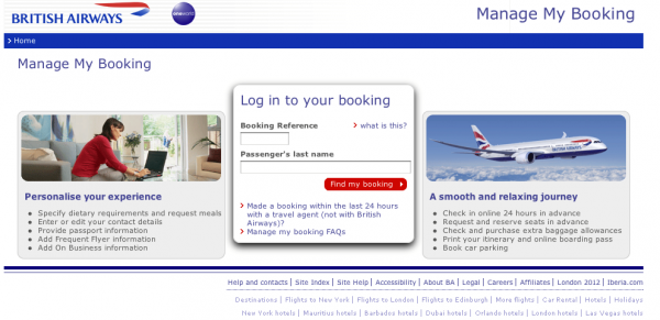
Here's one more service OVPs. A quirky but effective one here from BA encouraging visitors to use their online checkin. A while back they ran a "Have you clicked yet?' campaign to promote usage of online checkin.

I hope you find these online value proposition examples useful. Keep an eye out when you're on a site for the first time - many don't make their OVP or even their core brand proposition clear enough. Let us know of any you like!


